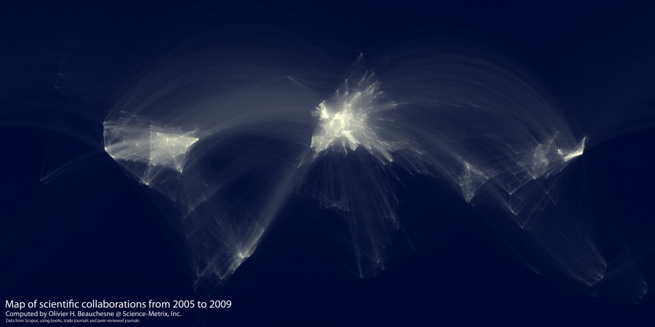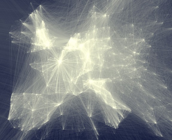
This lovely map of scientific collaboration is done by research analyst Olivier Beauchesne at Science-Metrixm who examined scientific collaboration around the world from 2005 to 2009. I love the way the patterns in the EU, so dense and flaring, look like the center of an explosion. Here’s the same EU pattern up close:

I would bet good money that similar patterns hold for literary pursuits, especially science writing. You can see why I so loved living in London (the brightest spot in the cluster at upper left), where you’re in the midst of immense international traffic both virtual and real — though there were many other reasons as well.
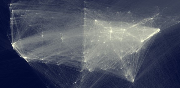
Here’s the close-up for the US:

The longer explanatory post is at the ever-gorgeous Flowing Data, where you can also find a high-res version. Hat-tip to the most excellent Sam Arbesman of Social Dimension, via Twitter.
Great images of free scale networks that show the flow scientific thought.
May I suggest the book “Linked” by Alber-Laszlo Barabasi, a major contributor to the development of network theory and research, to anyone interested in how these “hubs” might be influenced.
I wonder how much of the European hot spot was influenced by EU networking programmes